
You type your address into a real estate website, wait for the map to load, and see your block shaded a reassuring green. Then you notice that the estimate doesn't resemble your neighbor's recent sale, even though the homes look similar from the street. Your finished basement, newer kitchen, older roof, busy intersection, and unusual lot size all matter, but a colorful map may not show any of them.
A home value map is useful when you treat it as a starting point for research, not a final pricing decision. In Melrose Park and the western Chicago suburbs, the quality of the answer depends less on the color of the map than on the data beneath it, the comparison group selected, and the local details the model cannot see.
Table of Contents
- What A Home Value Map Actually Shows
- Decoding Valuation Layers And Data Sources
- Why Automated Map Estimates Miss The Mark
- Local Use Cases For Buyers And Sellers
- The Hidden Costs Maps Fail To Display
- Getting Accurate Local Data From Homes By Carmen
What A Home Value Map Actually Shows
Consider a homeowner in Melrose Park preparing for a possible move. The first online estimate lands above expectations, while a nearby map layer suggests a lower neighborhood value. Neither result is automatically wrong. The figures may describe different things, use different dates, or compare different types of homes.
A map that plots individual asking prices can make an area appear expensive because sellers are requesting ambitious prices. That isn't the same as showing what buyers paid. A more useful map displays standardized, geographically comparable price-change data, allowing you to examine market direction without confusing one unusual listing with the entire neighborhood.
Market movement versus one property
The Federal Housing Finance Agency's explanation of its House Price Index provides a strong model for understanding this distinction. Its weighted repeat-sales method compares price changes for the same property across multiple sales or refinancings. Because the method follows the same property rather than treating every sale as interchangeable, it can reduce distortion caused by comparing a renovated bungalow with a dated ranch or a small condominium with a large detached home.
The underlying mortgage records extend back to January 1975 and cover transactions associated with mortgages purchased or securitized by Fannie Mae and Freddie Mac. FHFA makes its indexes available at national, census-division, state, metropolitan-area, county, ZIP-code, and census-tract levels, with a database incorporating tens of millions of home sales across all 50 states and more than 400 U.S. cities. The index program began in 1995 under a predecessor agency, although its historical series reaches back to the mid-1970s.
Practical rule: Use a map to ask whether an area is appreciating, flattening, or losing momentum. Use property-level comparable sales to decide what one home may sell for.
The right question to ask
For a Melrose Park address, the useful question isn't "What number does the map show?" Ask instead:
- What does the number represent? Is it an asking price, a typical estimated value, an assessed value, or a market-change index?
- What homes are included? Check property type, size, age, and condition where the map provides those filters.
- What boundary is being used? A ZIP code, municipality, neighborhood, and census tract can produce different comparisons.
- What date does the figure describe? A recent-looking interface may still display a value based on older observations.
A home value map can reveal broad differences between Melrose Park, Oak Park, Elmhurst, and nearby western suburbs. It can't inspect the property, verify an improvement, judge a noisy location, or predict the exact offer a buyer will make. That makes it excellent for orientation and weak as a standalone listing strategy.
Decoding Valuation Layers And Data Sources
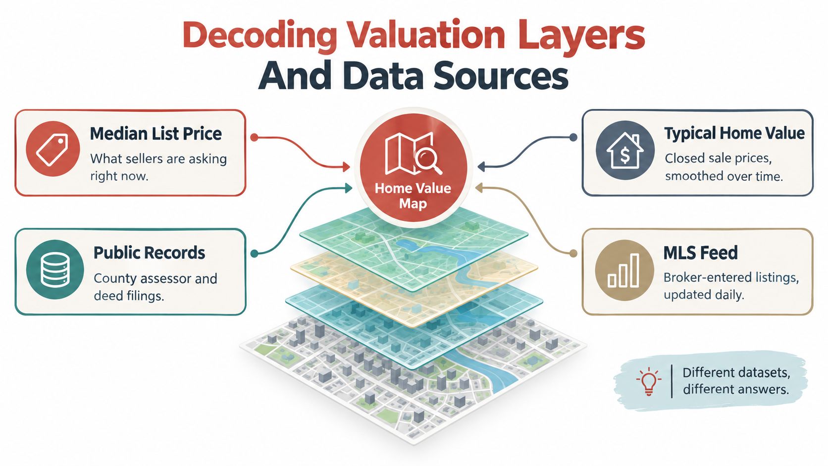
A home value map gets misleading fast when you treat every color patch as the same kind of number. In the western suburbs, that is how buyers and sellers end up comparing an asking-price layer to an assessment layer, or a market-trend index to an estimate for one specific house. Those are different tools built from different inputs, and they answer different questions.
A median list price reflects what sellers hope to get. A typical estimated value reflects a model built from recorded property data. A repeat-sales index follows price movement over time by looking at homes that sold more than once. Public assessment data is built for taxation and mass appraisal, not for pricing a renovated brick ranch on a particular block.
These layers can move in different directions without any of them being wrong. The actual task is to audit the data underneath the map before trusting the display.
Read the definition before the color
A typical-value layer usually describes the middle of a market, often using homes in the 35th-to-65th percentile range, rather than the median list price or the top sale on the block. That sounds tidy on screen. It also means the number is a summary, not a promise about any one property.
In places like Melrose Park, Elmhurst, Oak Park, and nearby communities, that distinction matters. One map area can include small postwar homes, updated two-stories, properties with additions, condos, and houses backing to busy roads or commercial strips. A single typical value can smooth over those differences and make uneven housing stock look more uniform than it is.
The same caution applies to tax and assessment layers. If the public record misses a finished basement, overstates living area, or lags behind a major renovation, the map can inherit that error. Climate exposure can distort things too. A flood-prone pocket, drainage issue, or insurance burden may affect what buyers will pay even when the value surface looks stable.
Compare like with like
A repeat-sales index helps track appreciation. A typical-value index helps show broad local direction. A property estimate tries to convert available records into a number for one address. A comparative market analysis lets an agent choose better comps and account for condition, layout, and micro-location that automated systems often miss.
Before you compare one suburb, ZIP code, or neighborhood with another, check the basics:
| Check | Why it matters |
|---|---|
| Valuation date | Markets and comparable sales change over time |
| Property type | Condos, townhomes, and detached homes behave differently |
| Geographic boundary | ZIP codes and neighborhood lines don't always match |
| Statistical definition | Asking price, typical value, assessment, and index movement answer different questions |
For local research, save the map view and read the definitions before drawing a conclusion. If the source does not explain coverage, update timing, filters, or confidence, treat the result cautiously. A home valuation calculator can help organize the basic facts first, then the number should be checked against local comparable sales and the property details the map may have missed.
Why Automated Map Estimates Miss The Mark
A model can see a sale date, recorded square footage, neighborhood boundary, and prior transaction. It usually can't see whether the basement is professionally finished, whether the roof is nearing replacement, or whether the back bedroom faces a loud commercial corridor.
That distinction becomes important in mixed housing stock. Melrose Park and nearby western suburbs include homes with different construction eras, additions, lot configurations, renovation levels, and micro-locations. A simple average can look precise while combining properties that a local buyer would never consider true substitutes.
The problem with sales chasing
Cook County's assessor describes sales chasing as relying too heavily on recently sold properties. This can bias a model toward high-turnover homes and produce inequitable outcomes. The assessor's methodology reviews modeled values neighborhood by neighborhood and class by class, which reflects a basic professional truth: local valuation requires checking how the model behaves inside each segment, not only whether the overall map looks smooth.
A useful diagnostic is the sales ratio, calculated as estimated or assessed value divided by the property's actual sale price. A responsible map should show median ratios and dispersion by neighborhood or property segment. One undifferentiated value surface can conceal whether estimates are consistently high, consistently low, or highly scattered in a particular area.
Audit the estimate before trusting it
When an estimate differs from a broker-supported comparative market analysis, check the inputs instead of assuming one side is careless.
- Property records: Confirm the recorded living area, bedroom count, bathrooms, finished basement, garage, and additions.
- Physical condition: Separate updated kitchens and mechanical systems from homes that need substantial work.
- Micro-location: Account for traffic, rail access, commercial adjacency, corner exposure, and street character.
- Comparable quality: Review whether the selected sales match the property type, size, condition, and location.
- Market liquidity: Treat sparse sales and unusual properties as less certain than active, homogeneous segments.
A map estimate is a screening output. It becomes a pricing opinion only after someone verifies the property and the comparable evidence.
Look for a comparable count, sale-date range, price spread, and any available confidence information. If those details aren't visible, don't manufacture certainty. Request a free home valuation and use the conversation to identify which property facts the automated result may have missed.
Local Use Cases For Buyers And Sellers
The best use of a home value map is decision support. It helps narrow a search, test a pricing assumption, or identify an area that deserves closer inspection. It doesn't replace a showing, an inspection, a financing review, or a careful analysis of actual comparable sales.
Sellers need context, not a green neighborhood
A seller can use a map to observe how nearby areas compare and whether the local market appears to be moving in the same direction as the broader metropolitan area. That context helps set expectations before choosing a list price.
The practical workflow is straightforward:
- Start with the geographic pattern. Review the immediate neighborhood, nearby suburbs, and the broader market separately.
- Separate property types. Don't combine condos, small detached homes, and larger renovated properties without a reason.
- Pull recent comparable sales. Prioritize homes buyers could realistically substitute for yours.
- Adjust for condition. A renovated interior, finished basement, newer roof, or deferred maintenance can change the competitive position.
- Test the launch strategy. Consider likely buyer reactions, showing volume, offer quality, and the cost of sitting above the market.
A heatmap may support a confident pricing conversation, but it can't determine whether a home should launch aggressively or slightly below comparable value to attract attention. That choice depends on condition, competition, timing, and the seller's tolerance for risk.
Buyers can use maps to find questions
Buyers comparing Elmhurst, Downers Grove, Glen Ellyn, or Melrose Park can use valuation layers to locate areas that deserve a closer look. A lower map value doesn't automatically mean a bargain. It may reflect smaller homes, older construction, fewer recent sales, weaker amenities, or a boundary that groups unlike properties.
During the search, compare:
- Price against condition: A cheaper home may require work that erases the apparent discount.
- Neighborhood against daily routine: Transit access, school boundaries, commute patterns, and nearby services can affect practical value.
- Map estimate against offer evidence: Review recent closed sales and current competition before writing an offer.
- Gross price against monthly ownership: Include taxes, insurance, utilities, repairs, and association costs where applicable.
Investors can use the same process to screen neighborhoods for potential long-term appreciation, but a map can't replace rent analysis, operating expenses, vacancy assumptions, capital improvements, or an inspection. The profitable opportunity often sits in the details the map doesn't display.
The Hidden Costs Maps Fail To Display
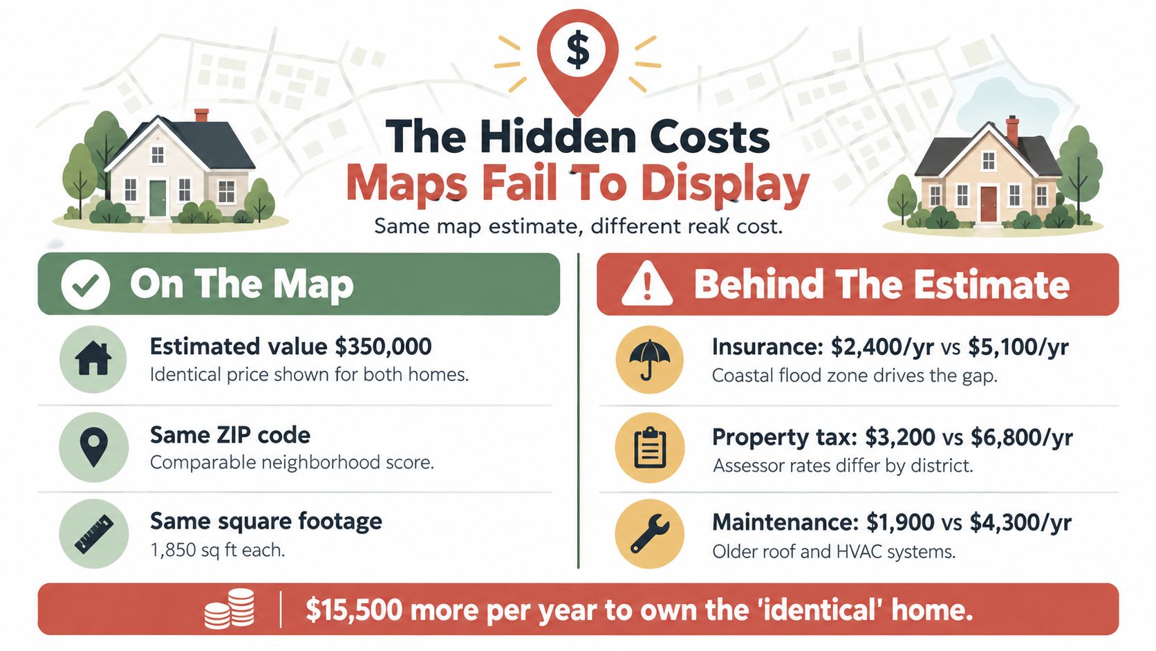
Two homes can receive similar map estimates and still carry very different financial consequences. One may be easy to insure, efficient to maintain, and protected from recurring water problems. The other may face difficult coverage, high deductibles, basement exposure, or expensive mitigation needs.
Market value isn't net value
A conventional map focuses on sales and property characteristics. It usually doesn't model an insurance quote, deductible, coverage restriction, sewer-backup exposure, basement drainage, hail risk, or the effect of rising premiums on buyer affordability.
The National Bureau of Economic Research analysis of housing, climate risk, and insurance found that a reinsurance-market shock reduced home values by an average of $8,400. The same analysis describes broader 2025 U.S. estimates in which 26.1% of homes, representing $12.7 trillion in value, faced at least one severe or extreme climate risk. Severe or extreme flood risk alone affected about 6.1% of homes, valued at nearly $3.4 trillion.
Those figures don't tell you what a particular western suburban property is worth. They do show why insurance-market conditions can affect prices even when the building itself hasn't changed. For Chicagoland buyers and sellers, the relevant risks may include flooding, basement water, hail, wind, sewer backups, and changing insurance availability.
Ask for the costs behind the estimate
Before setting a price or making an offer, obtain an insurance quote early. Review deductibles, exclusions, prior claims, drainage history, flood information, and any mitigation work, then compare those costs with the map's gross value.
Net-value check: Two nearby homes with similar estimated values may have materially different practical values once insurability, deductibles, repairs, and buyer affordability enter the calculation.
Keep these categories separate:
- Gross market value: What comparable buyers may pay for the property.
- Net sale proceeds: The amount remaining after selling expenses, credits, repairs, and other transaction costs.
- Ownership cost: Insurance, taxes, utilities, maintenance, and financing obligations.
- Risk-adjusted value: The practical value after accounting for hazards, coverage, mitigation, and future affordability.
A map is useful for the first category. A sound purchase or pricing decision requires all four.
Getting Accurate Local Data From Homes By Carmen
A dependable valuation starts with better inputs and ends with human review. You don't need to discard online research. You need to use it to prepare sharper questions for someone who can inspect the property details and interpret local buyer behavior.
Start with a clean property record
Gather the information an automated map may misread or omit:
- Finished basement details and usable living areas
- Renovations, additions, and dates of major improvements
- Roof, furnace, air-conditioning, windows, and other mechanical updates
- Garage configuration, lot characteristics, and unusual site features
- Noise, traffic, transit access, school boundaries, and nearby commercial uses
- Water history, drainage improvements, insurance claims, and current coverage concerns
Correcting public-record errors matters. A wrong square-footage figure or missing improvement can distort the comparison set before anyone discusses price.
Request a local comparative analysis
A professional comparative market analysis should examine recent, relevant sales rather than relying on a broad neighborhood average. The analysis should distinguish property type and condition, explain why each comparable was selected, and account for features buyers notice during a showing.
Use the home valuation report as a starting point for organizing the property facts and market evidence. Then ask the professional to explain the range, the strongest comparable, the weakest comparable, and the risks that could move the final price above or below the initial estimate.
Turn the result into a decision
For a seller, the next step may be preparing the home, correcting records, obtaining insurance information, and choosing a list-price strategy. For a buyer, it may mean comparing the map estimate with an offer price, inspection findings, financing terms, and long-term ownership costs.
The goal isn't to find a more flattering number. It's to understand why the number exists and whether it survives local scrutiny. That approach is especially valuable in Melrose Park and western Chicagoland, where a short distance can bring different housing stock, taxes, transit conditions, school boundaries, and buyer preferences.
Homes By Carmen provides complimentary property valuations and strategy consultations grounded in local market knowledge for Melrose Park and the western Chicago suburbs. Visit Homes By Carmen to move beyond a generic home value map and request a property-specific review before you price, offer, or list.